Dialogs
3 of 40 components implemented · Open in Figma
report a catalog issue
Swipe across to explore the sheet · + to zoom
Double-click a section to zoom · ⌘/Ctrl-scroll · drag to pan · + / − / 0 by keyboard · Esc resets
Code Connect
design-map
name match
override variant
not implemented
 Type=Text, Icon=Yes, Body=Yes, Body text alignment=Left — no code behind this
Type=Text, Icon=No, Body=Yes, Body text alignment=Centred — no code behind this
Type=Text, Icon=Yes, Body=Yes, Body text alignment=Centred — no code behind this
Type=Text, Icon=No, Body=Yes, Body text alignment=Left — no code behind this
Type=Text, Icon=Yes, Body=No, Body text alignment=N/A — no code behind this
Type=Text, Icon=No, Body=No, Body text alignment=N/A — no code behind this
Type=Progress, Icon=Yes, Body=Yes, Body text alignment=Centred — no code behind this
Type=Progress, Icon=Yes, Body=Yes, Body text alignment=Left — no code behind this
Type=Progress, Icon=Yes, Body=No, Body text alignment=Centred — no code behind this
Type=Contact — no code behind this
Type=List-ButtonGroups — no code behind this
Type=List-Buttons — no code behind this
Type=Allow or Deny — no code behind this
Type=Toggle Button — no code behind this
Type=List-Toggles — no code behind this
Type=List-RadioButtons — no code behind this
Type=List-Tasks — no code behind this
Type=Title — no code behind this
Type=Text Group — no code behind this
Type=Body Text - Left — no code behind this
Type=Body Text - Centred — no code behind this
Type=Progress — no code behind this
Type=Progress-Linear — no code behind this
Edge Option=Edge Button, Scrolling=Yes, Bottom=Yes — no code behind this
Edge Option=Double Button + Edge Button Stack, Scrolling=Yes, Bottom=Yes — no code behind this
Edge Option=Single Button + Edge Button Stack, Scrolling=Yes, Bottom=Yes — no code behind this
Edge Option=Double Angled Button, Scrolling=Yes, Bottom=Yes — no code behind this
Edge Option=Double Button Fixed, Scrolling=Yes, Bottom=Yes — no code behind this
Edge Option=Double Button Flex, Scrolling=Yes, Bottom=Yes — no code behind this
Edge Option=Double Button Sml, Scrolling=Yes, Bottom=Yes — no code behind this
Edge Option=Single Button Sml, Scrolling=Yes, Bottom=Yes — no code behind this
Edge Option=Double Button Stack, Scrolling=Yes, Bottom=Yes — no code behind this
Edge Option=None, Scrolling=Yes, Bottom=No — no code behind this
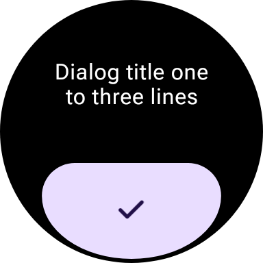
Edge Option=Edge Button, Scrolling=No, Bottom=Yes — catalog/src/commonMain/kotlin/ee/schimke/wearm3catalog/sections/Dialogs.kt#AlertDialogSticker
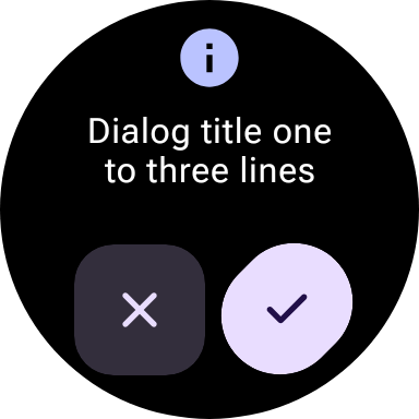
Edge Option=Double Angled Button, Scrolling=No, Bottom=Yes — catalog/src/commonMain/kotlin/ee/schimke/wearm3catalog/sections/Dialogs.kt#AlertDialogSticker
Edge Option=Double Button Fixed, Scrolling=No, Bottom=Yes — no code behind this
Edge Option=Double Button Flex, Scrolling=No, Bottom=Yes — no code behind this
Edge Option=Double Button Sml, Scrolling=No, Bottom=Yes — no code behind this
Edge Option=Single Button Sml, Scrolling=No, Bottom=Yes — no code behind this
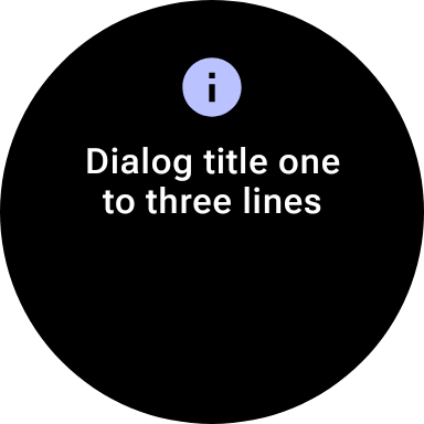
Edge Option=None, Scrolling=No, Bottom=No — catalog/src/commonMain/kotlin/ee/schimke/wearm3catalog/sections/Dialogs.kt#AlertDialogSticker
Type=Text, Icon=Yes, Body=Yes, Body text alignment=Left — no code behind this
Type=Text, Icon=No, Body=Yes, Body text alignment=Centred — no code behind this
Type=Text, Icon=Yes, Body=Yes, Body text alignment=Centred — no code behind this
Type=Text, Icon=No, Body=Yes, Body text alignment=Left — no code behind this
Type=Text, Icon=Yes, Body=No, Body text alignment=N/A — no code behind this
Type=Text, Icon=No, Body=No, Body text alignment=N/A — no code behind this
Type=Progress, Icon=Yes, Body=Yes, Body text alignment=Centred — no code behind this
Type=Progress, Icon=Yes, Body=Yes, Body text alignment=Left — no code behind this
Type=Progress, Icon=Yes, Body=No, Body text alignment=Centred — no code behind this
Type=Contact — no code behind this
Type=List-ButtonGroups — no code behind this
Type=List-Buttons — no code behind this
Type=Allow or Deny — no code behind this
Type=Toggle Button — no code behind this
Type=List-Toggles — no code behind this
Type=List-RadioButtons — no code behind this
Type=List-Tasks — no code behind this
Type=Title — no code behind this
Type=Text Group — no code behind this
Type=Body Text - Left — no code behind this
Type=Body Text - Centred — no code behind this
Type=Progress — no code behind this
Type=Progress-Linear — no code behind this
Edge Option=Edge Button, Scrolling=Yes, Bottom=Yes — no code behind this
Edge Option=Double Button + Edge Button Stack, Scrolling=Yes, Bottom=Yes — no code behind this
Edge Option=Single Button + Edge Button Stack, Scrolling=Yes, Bottom=Yes — no code behind this
Edge Option=Double Angled Button, Scrolling=Yes, Bottom=Yes — no code behind this
Edge Option=Double Button Fixed, Scrolling=Yes, Bottom=Yes — no code behind this
Edge Option=Double Button Flex, Scrolling=Yes, Bottom=Yes — no code behind this
Edge Option=Double Button Sml, Scrolling=Yes, Bottom=Yes — no code behind this
Edge Option=Single Button Sml, Scrolling=Yes, Bottom=Yes — no code behind this
Edge Option=Double Button Stack, Scrolling=Yes, Bottom=Yes — no code behind this
Edge Option=None, Scrolling=Yes, Bottom=No — no code behind this
Edge Option=Edge Button, Scrolling=No, Bottom=Yes — catalog/src/commonMain/kotlin/ee/schimke/wearm3catalog/sections/Dialogs.kt#AlertDialogSticker
Edge Option=Double Angled Button, Scrolling=No, Bottom=Yes — catalog/src/commonMain/kotlin/ee/schimke/wearm3catalog/sections/Dialogs.kt#AlertDialogSticker
Edge Option=Double Button Fixed, Scrolling=No, Bottom=Yes — no code behind this
Edge Option=Double Button Flex, Scrolling=No, Bottom=Yes — no code behind this
Edge Option=Double Button Sml, Scrolling=No, Bottom=Yes — no code behind this
Edge Option=Single Button Sml, Scrolling=No, Bottom=Yes — no code behind this
Edge Option=None, Scrolling=No, Bottom=No — catalog/src/commonMain/kotlin/ee/schimke/wearm3catalog/sections/Dialogs.kt#AlertDialogSticker
3 of 40 components implemented
Type=Text, Icon=Yes, Body=Yes, Body text alignment=Leftno code behind this
Type=Text, Icon=No, Body=Yes, Body text alignment=Centredno code behind this
Type=Text, Icon=Yes, Body=Yes, Body text alignment=Centredno code behind this
Type=Text, Icon=No, Body=Yes, Body text alignment=Leftno code behind this
Type=Text, Icon=Yes, Body=No, Body text alignment=N/Ano code behind this
Type=Text, Icon=No, Body=No, Body text alignment=N/Ano code behind this
Type=Progress, Icon=Yes, Body=Yes, Body text alignment=Centredno code behind this
Type=Progress, Icon=Yes, Body=Yes, Body text alignment=Leftno code behind this
Type=Progress, Icon=Yes, Body=No, Body text alignment=Centredno code behind this
Type=Contactno code behind this
Type=List-ButtonGroupsno code behind this
Type=List-Buttonsno code behind this
Type=Allow or Denyno code behind this
Type=Toggle Buttonno code behind this
Type=List-Togglesno code behind this
Type=List-RadioButtonsno code behind this
Type=List-Tasksno code behind this
Type=Titleno code behind this
Type=Text Groupno code behind this
Type=Body Text - Leftno code behind this
Type=Body Text - Centredno code behind this
Type=Progressno code behind this
Type=Progress-Linearno code behind this
Edge Option=Edge Button, Scrolling=Yes, Bottom=Yesno code behind this
Edge Option=Double Button + Edge Button Stack, Scrolling=Yes, Bottom=Yesno code behind this
Edge Option=Single Button + Edge Button Stack, Scrolling=Yes, Bottom=Yesno code behind this
Edge Option=Double Angled Button, Scrolling=Yes, Bottom=Yesno code behind this
Edge Option=Double Button Fixed, Scrolling=Yes, Bottom=Yesno code behind this
Edge Option=Double Button Flex, Scrolling=Yes, Bottom=Yesno code behind this
Edge Option=Double Button Sml, Scrolling=Yes, Bottom=Yesno code behind this
Edge Option=Single Button Sml, Scrolling=Yes, Bottom=Yesno code behind this
Edge Option=Double Button Stack, Scrolling=Yes, Bottom=Yesno code behind this
Edge Option=None, Scrolling=Yes, Bottom=Nono code behind this
Edge Option=Edge Button, Scrolling=No, Bottom=Yescatalog/src/commonMain/kotlin/ee/schimke/wearm3catalog/sections/Dialogs.kt#AlertDialogSticker
Edge Option=Double Angled Button, Scrolling=No, Bottom=Yescatalog/src/commonMain/kotlin/ee/schimke/wearm3catalog/sections/Dialogs.kt#AlertDialogSticker
Edge Option=Double Button Fixed, Scrolling=No, Bottom=Yesno code behind this
Edge Option=Double Button Flex, Scrolling=No, Bottom=Yesno code behind this
Edge Option=Double Button Sml, Scrolling=No, Bottom=Yesno code behind this
Edge Option=Single Button Sml, Scrolling=No, Bottom=Yesno code behind this
Edge Option=None, Scrolling=No, Bottom=Nocatalog/src/commonMain/kotlin/ee/schimke/wearm3catalog/sections/Dialogs.kt#AlertDialogSticker